Case Studies
Case Study - CDC's Emergency Operations Center (EOMS) Homepage
In late 2009, Lockheed Martin was engaged by the CDC to create the Emergency Operations Management System (EOMS), a suite of 18+ public health and emergency response applications. One of the biggest challenges was establishing a consistent user interface so responders could get up to speed quickly. During an event, subject matter experts (SMEs) were flown into Atlanta to staff the CDC Emergency Operations Center in Building 24. These SMEs not only had to figure out how best to respond to the emerging incident, they also had to learn an entirely new set of applications while under intense time pressure.
At that time, before common frameworks like Bootstrap were widely available, most government development teams did not include dedicated UI and UX designers. Developers typically built the interfaces themselves, often using a mishmash of third-party controls. The result was that each application looked and behaved differently: inconsistent menus, colors, typography, and icons, which made onboarding new users much harder. Even though “UI/UX” wasn’t formally a labor category on the contract, I was able to convince the Program Manager to let me design the interfaces for the EOMS applications. My goal was to give them a unified look and feel so new users could move between apps without relearning the basics each time. I also produced on-demand computer-based training videos to support SMEs as they worked in the Emergency Operations Center.
The central launching point for all CDC EOMS applications, links, and resources was the EOMS Homepage. By today’s standards it looks cluttered, but 15 years ago it was considered a comprehensive interface that provided every available option in one place. By 2018, our team successfully persuaded CDC leadership that the EOMS Homepage needed a significant redesign. User expectations had evolved, thanks to iPhones, iPads, and modern UI frameworks, and it was clear the existing homepage felt overwhelming and dated. Leadership requested two design concepts: one that offered a more dynamic, tile-based “iPad style” interface to help users quickly locate what they needed, and another that functioned as a contemporary data dashboard, grouping related menu options into logical categories so users could reach their applications, links, and resources in two or three clicks. I designed both options, and after review, CDC approved the dashboard-style concept for implementation.
Our team was ultimately recognized with the CDC Certificate of Excellence, awarded for our work on EOMS and our support of the Emergency Operations Center. The award acknowledged not just the technical delivery of 18+ integrated applications, but also the user-centered design, training, and support of the EOC that enabled responders to work more efficiently during high-pressure public health events.
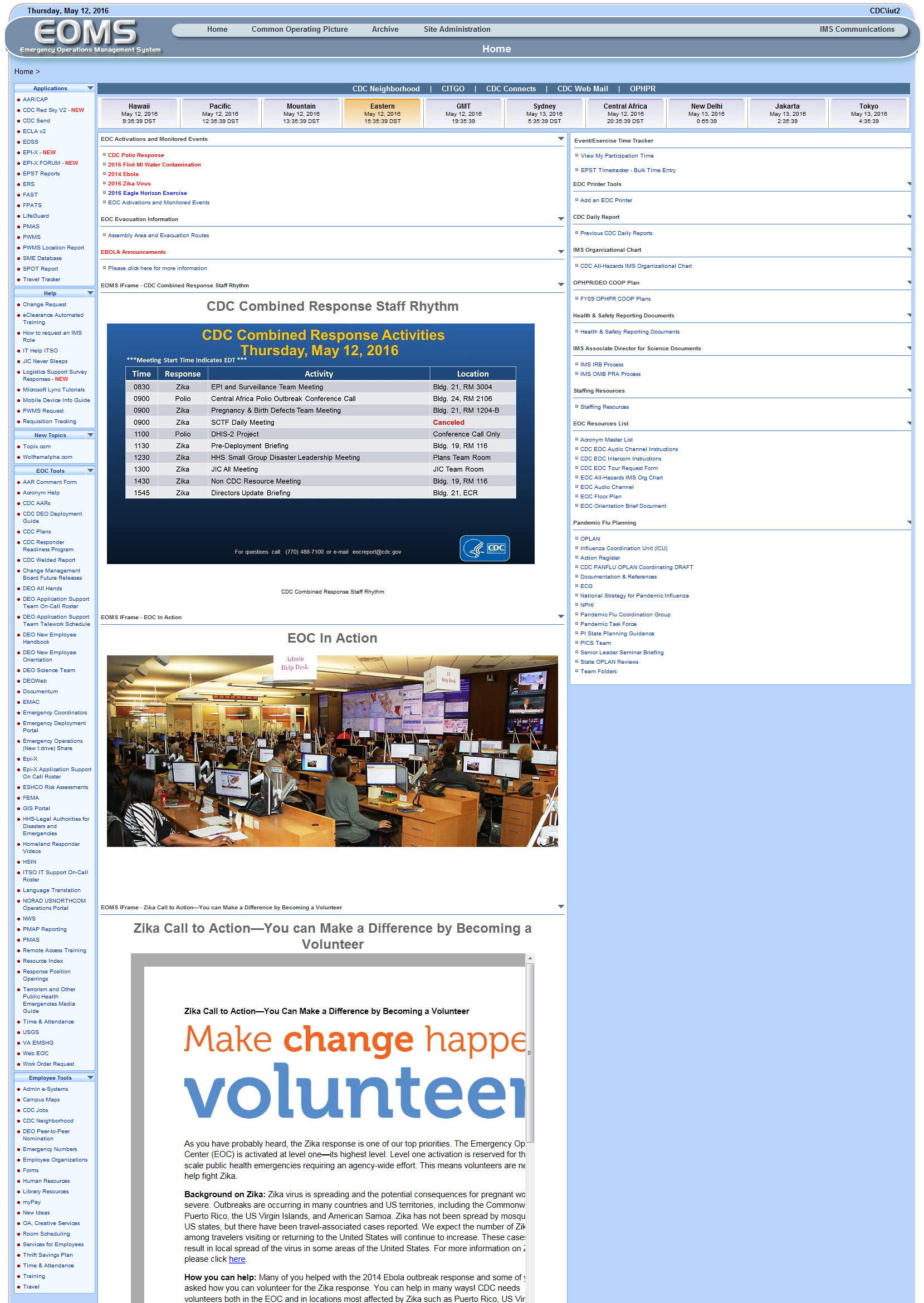 Original EOMS Homepage
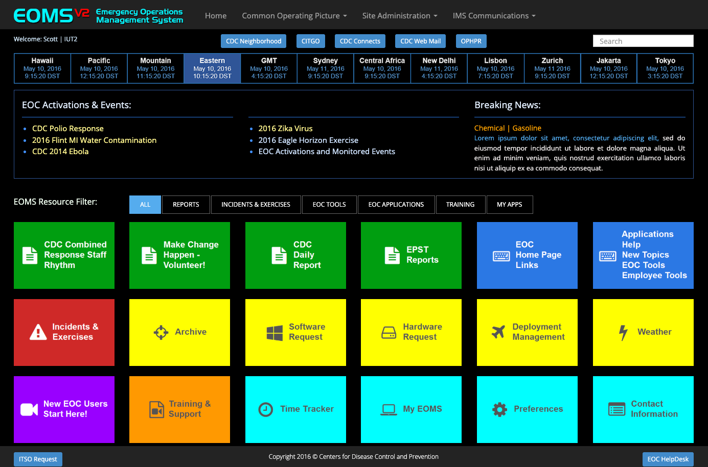 High-Fidelity Prototype 1
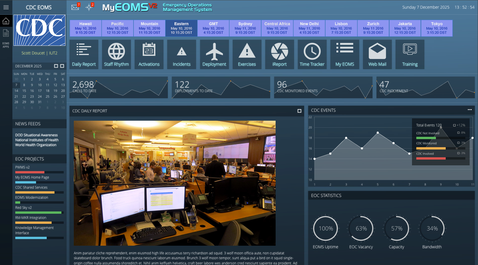 High-Fidelity Prototype 2
508 Accessibility & Remediation Testing
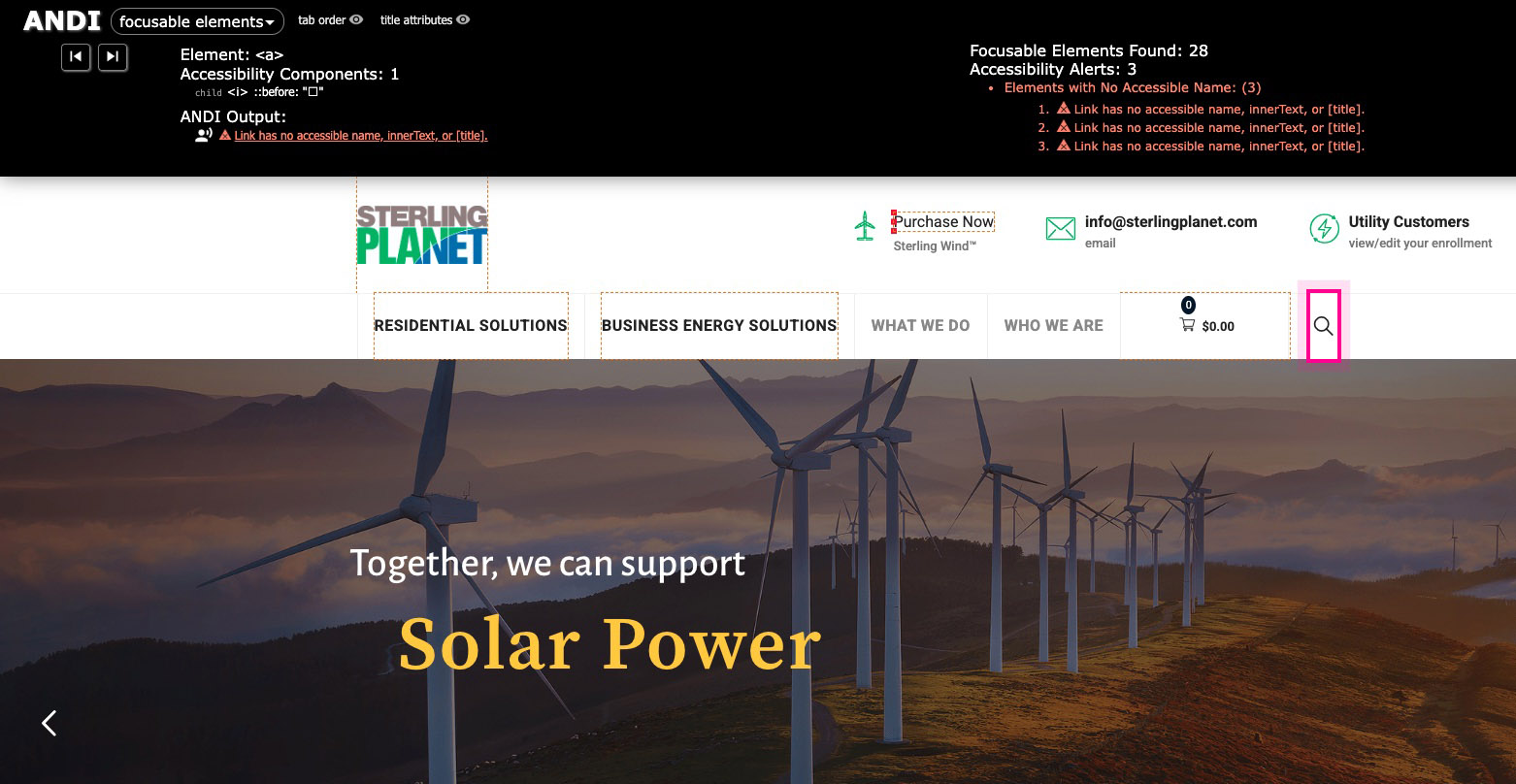
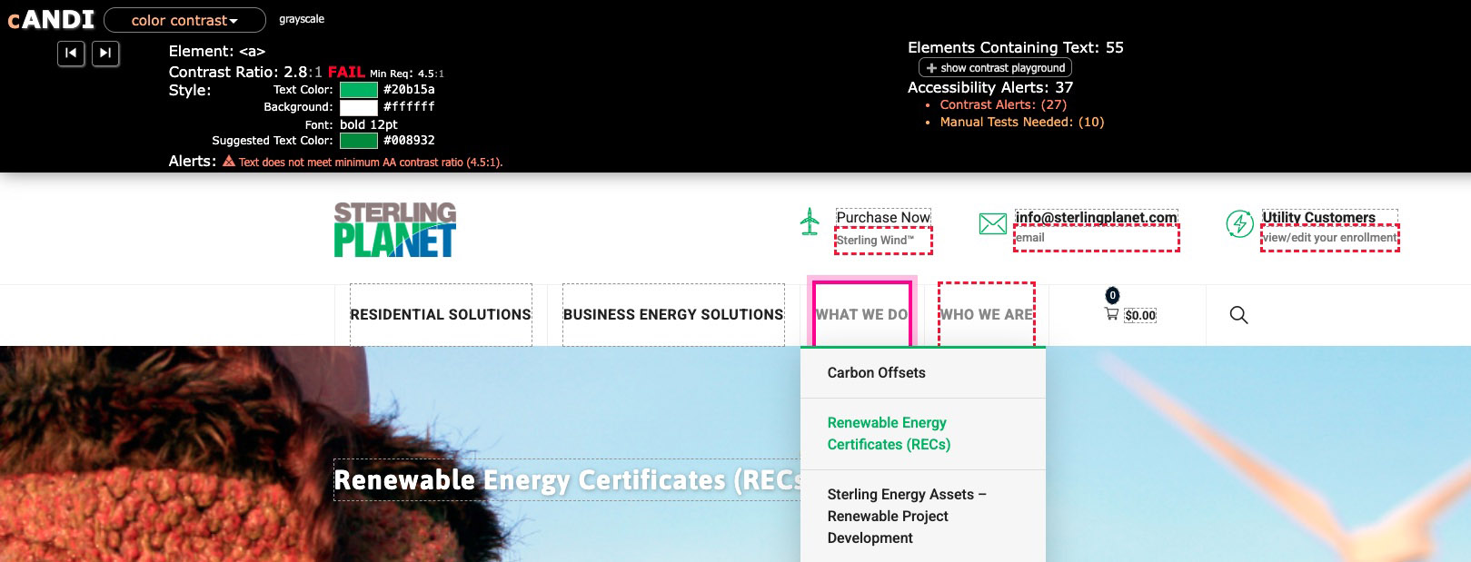
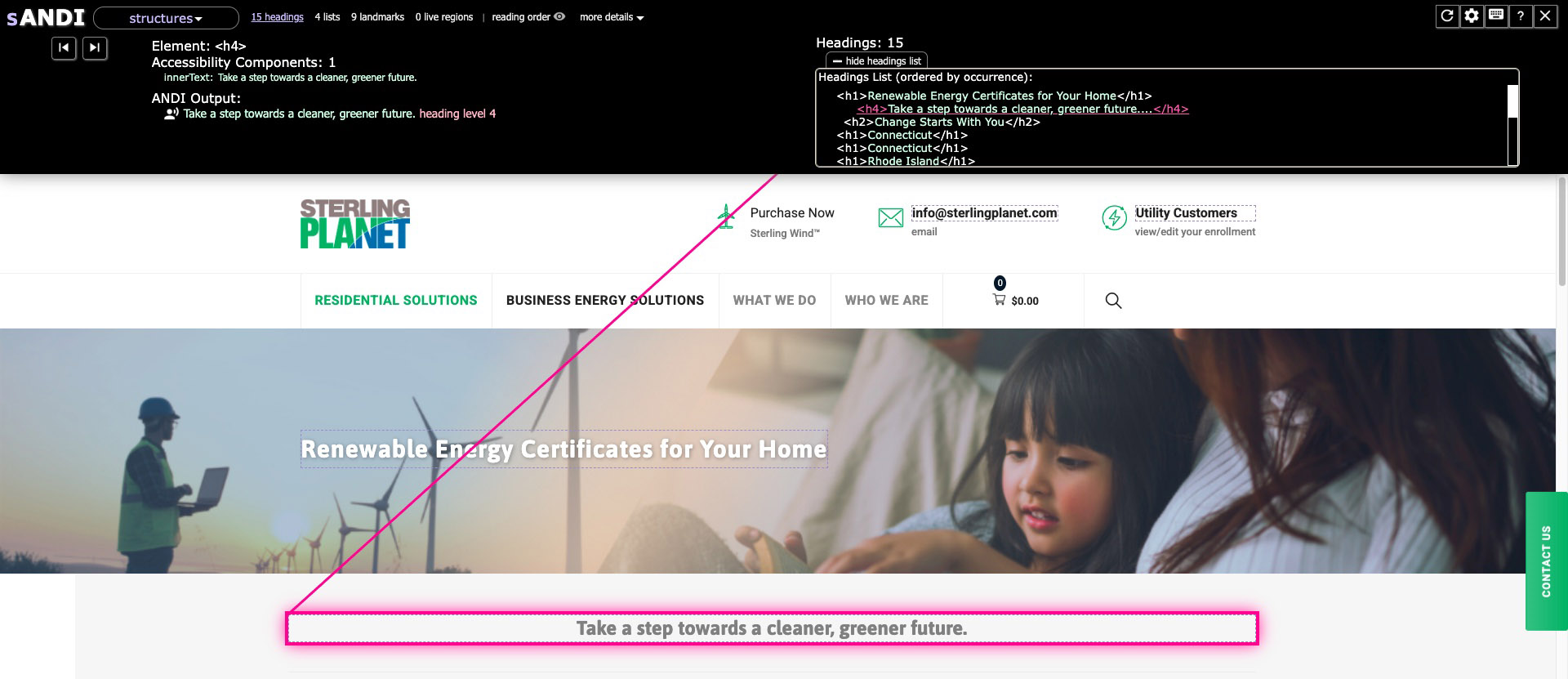
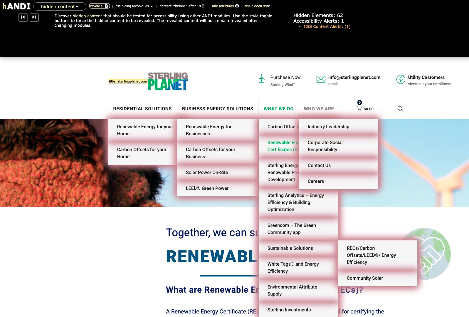
Sterling Planet is a leader in renewable energy certificates and renewable energy solutions. Their work has attracted state and federal government clients, which means their corporate website often serves as the first point of contact for government employees. Because of this audience, it was critical that the site meet Section 508 accessibility requirements.
To evaluate the site, I used the Accessible Name & Description Inspector (ANDI) and the Color Contrast Analyser to review their WordPress implementation. While many WordPress plugins support 508 and WCAG guidelines, they tend to focus on color contrast, missing alt attributes, and basic typography. A complete assessment still requires hands-on manual testing to identify real-world usability and compliance issues.
Key findings and remediation approach highlights:
-
Links without accessible names. Many
<a>elements had no visible text or programmatic label, so screen reader users would only hear that a link exists without any indication of its purpose. The recommended fix is to add meaningful visible link text. When an icon-only link is required for design reasons, an accessible label should be added to the anchor, for example:<a href="/cart" aria-label="View cart">…</a>. -
Anchor elements missing
href. Some anchors were used as clickable elements without a properhref, which makes them unreliable for keyboard users. Where the element is truly a link, it should be given a validhref. If it behaves like a button (for example, opening a menu or modal), it should be converted to a<button type="button">so it is fully keyboard accessible and semantically correct. -
Headings out of sequence. The heading structure was out of order in several places. A well-structured page should follow a logical
<h1>through<h6>hierarchy without skipping levels, with a single<h1>as the page title and subsequent sections marked up as<h2>,<h3>, and so on. Remediation involved adjusting headings so they accurately reflect the content hierarchy. - Color contrast issues. Some text elements did not meet the minimum 508/WCAG contrast ratios. These issues are straightforward to fix with CSS or theme adjustments. My approach is to define a base, 508-compliant CSS layer early in the project and, for existing sites, introduce new utility classes with corrected colors that can be applied directly to the affected text and headings.
-
Non-descriptive image alternatives. Several images relied on generic or file-based alternative text that did not communicate their purpose to assistive technologies. For example, an image with alt text such as
"banner1"should use a more descriptive alternative like"Solar power installation"so users understand what is being shown. - Positive findings: tab order and skip links. On the positive side, most pages followed a logical tab order that aligned with the visual reading sequence, which supports efficient keyboard navigation. In addition, each page included a “skip to content” link at the top, allowing keyboard and screen reader users to bypass repeated navigation and move directly to the main content area.
Together, these findings provided Sterling Planet with a clear remediation plan and a set of patterns they can apply across future pages, helping ensure their digital presence better supports government users and remains aligned with Section 508 and WCAG guidelines.
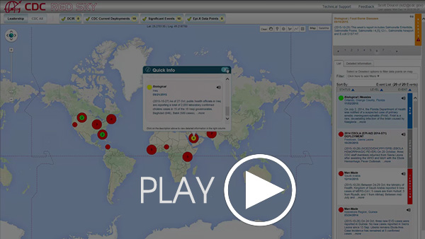
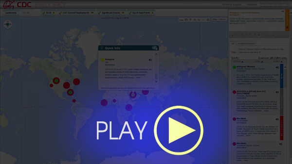 CDC Red Sky Introduction Video
Click any image to expand
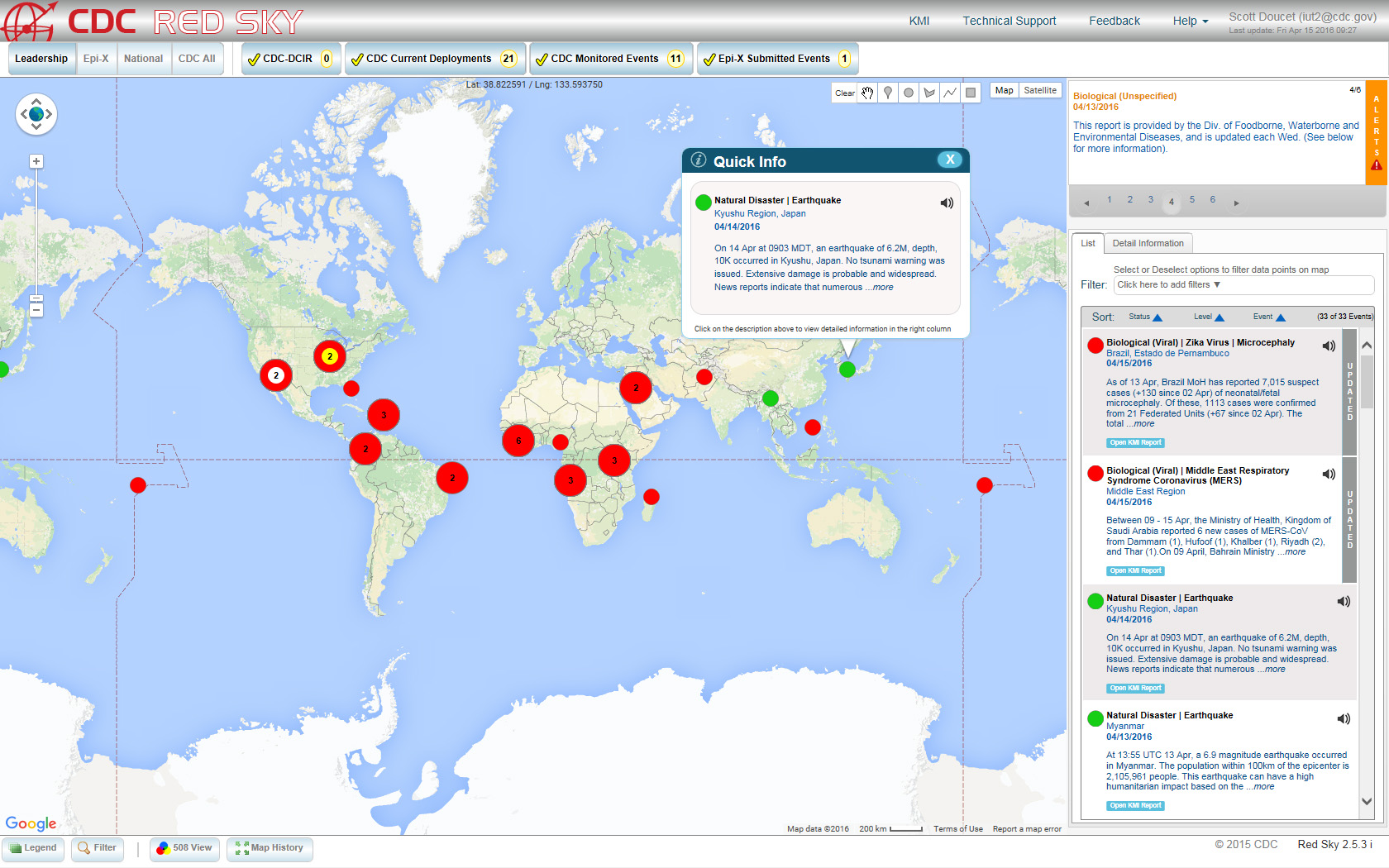 CDC Red Sky Dashboard
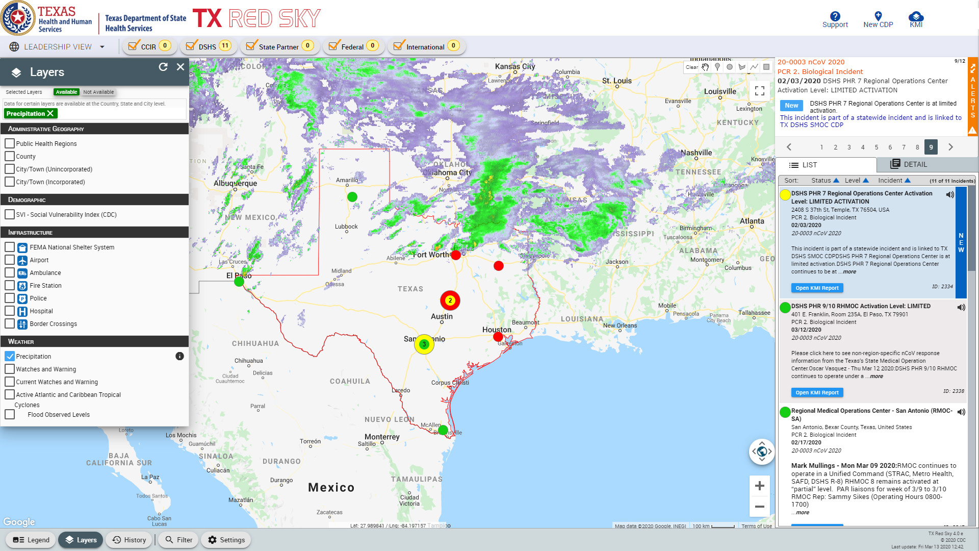 Texas Red Sky Dashboard
CDC's Red Sky Data Visualization Dashboard
The CDC’s Situational Awareness Branch (SA) Team is responsible for collecting and analyzing global health data in real time, then transforming it into situational reports and visual summaries that help leadership decide how and when CDC should engage. Their core mandate is to answer a few critical questions: What’s happening? Where is it happening? How serious is it? How fast is it changing? and, just as importantly, to project what might happen next so decision-makers can act proactively.
Traditionally, this work was heavily paper-based, supported by static maps, charts, and graphics. Information was scattered across binders, files, and shared drives, which made the process tedious and time-consuming. In early 2010, CDC leadership recognized that a more modern, integrated solution was needed, one that could show relevant public health events on a map along with the supporting documentation in a single, unified view.
The result was Red Sky, a dynamic, real-time data visualization dashboard that displays global public health events as color-coded points on a Google Map. Each color indicates CDC’s level of involvement from “monitoring” to full deployments worldwide. Hovering over a point reveals a Quick Info dialog with a brief description; selecting the text zooms into the event location and opens a detail view that can include attachments, maps, data tables, and situation reports.
Data flows into Red Sky automatically through the Knowledge Management Interface (KMI), a dedicated application that aggregates feeds from multiple CDC emergency operations systems. Red Sky also supports additional map layers such as weather, infrastructure, demographics, and custom overlays so analysts can see the full context around an event, not just its location. After reviewing new incident information, the SA team decides what should be published to Red Sky and when alerts should be sent to CDC leadership and partner agencies, including the Pentagon and the White House. With appropriate credentials, users outside the CDC’s federal firewall can securely access Red Sky, giving interagency partners a single, real-time source of vetted information to support coordinated decision-making.
Since its launch, Red Sky has drawn interest from emergency operations centers across the United States and internationally. Representatives from Thailand visited CDC to explore how a customized version could support their own emergency response operations, and in 2018 the Texas Department of Health and Human Services became the first state to deploy a state-level Red Sky implementation.
My role on both the CDC and Texas Red Sky projects spanned several disciplines. I served as the UI/UX designer shaping the look and feel of the interface, a business analyst documenting requirements and business rules, an accessibility specialist performing Section 508 conformance testing, and a training developer creating on-demand computer-based training videos to help new users quickly understand and effectively use the system.
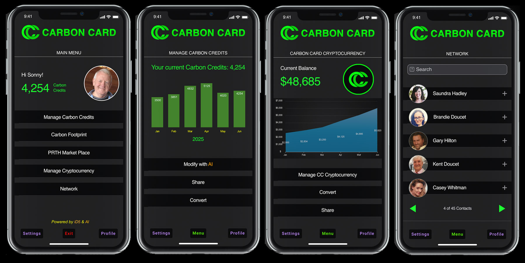
Sterling Planet Carbon Card Mobile App
Priority Technology Holdings (PRTH), in partnership with Sterling Planet, set out to translate their sustainability vision into a tangible product concept through the Carbon Card mobile app. Their goal was to leverage their expertise in Renewable Energy Certificates and renewable energy solutions into a green marketing and loyalty program for auto dealerships. The mobile app would provide customers an easy way to track their carbon footprint, earn green points tied to vehicle purchases and maintenance, and receive recommendations that support more sustainable driving habits.
I met with the principals to clarify the goals, target audiences, and constraints, then created a detailed requirements specification that defined how the Carbon Card app would function in the real world. The specification outlined how eco-conscious drivers would enroll, connect their vehicle and dealership activity, track their spending and related behaviors, and see the environmental impact of their choices. It also described how green points would be earned and redeemed, and how the app would deliver personalized recommendations that help users reduce emissions over time while reinforcing loyalty to participating dealerships.
I designed the UI to be intuitive, engaging, and informative, with a focus on making it feel approachable for everyday users. One of the key challenges was translating abstract green and renewable energy concepts into simple, visual explanations that people could easily understand and apply in their day-to-day lives. To bring this concept to life, I incorporated AI-driven calculations that translate established green and renewable metrics into practical energy insights. These models estimate how everyday choices and related purchases affect each person’s carbon footprint, allowing the app to continuously monitor impact and convert those actions into meaningful green points and personalized recommendations.
I then led the development team through implementation, using the requirements and prototypes as a roadmap for both front end and back end work. The result was a blueprint for a mobile app that connects everyday driving and service activity to tangible sustainability outcomes, helps users manage and understand their carbon footprint and green points, and strengthens the relationship between drivers and auto dealerships by encouraging both new purchases and ongoing maintenance.